Visualizing Pipeline Profiles
Preliminaries
The Feldera SQL compiler transforms a program into a dataflow graph. The profile viewer draws the dataflow graph. A dataflow graph has these kinds of objects:
| Object | What it is |
|---|---|
| Node (operator) | A computation. A SQL operation, for example a join or an aggregate, usually compiles into many nodes. |
| Edge | A directed flow of data between two nodes. It carries the changes that a node produces when it receives inputs. |
| Region | A node that contains another dataflow graph. See Regions. |
Feldera queries run continuously, each receiving many input changes and producing many output changes. So multiple Feldera views are compiled into a single pipeline, which then runs for a long time, receiving inputs and producing outputs.
"Profiling" in programming is the technique of measuring and understanding the behavior of computer programs.
The Feldera engine contains lots of instrumentation code which collects measurements about the behavior of each node. These measurements are aggregated into measurement statistics. For example, the code may measure how much time a node spends to process each change. During the lifetime of a pipeline each node may be invoked millions of times, so the information is summarized, for example as the "total time" spent executing this node.
There are many interesting measurements that may be collected; other
examples are: how much data is received by the node, how much data
is produced by the node (note that a node for WHERE
produces less data than it receives), how much data was written to
disk, how much memory was allocated by a node, when searching for
a value what is the success rate (for JOIN operations), etc.
Feldera pipelines are designed to take advantage of multiple CPU cores (and will soon use multiple computers as well, each with multiple cores). When you start a pipeline you specify a number of workers. Each node of the dataflow graph runs on all the worker threads of each host of the pipeline. The profiling code collects measurements for each worker.
Opening the profile viewer
The profile viewer is part of the Web Console, the browser-based dashboard of the Feldera instance. It shows the dataflow graph of a pipeline, with the measurements of each node.
The viewer reads the profiles from a support bundle. A support bundle may contain profiles at multiple points in time. The viewer shows the measurements as they were when the profile was collected. It does not update them live.
You can open a profile in the viewer in three ways:
| To | Home page | Pipeline page | Profile viewer |
|---|---|---|---|
| Download a profile from a pipeline | Not available | Click View profile. | Click Load profile, then Download profile. |
| Open a bundle that you opened before | Click , then click the bundle.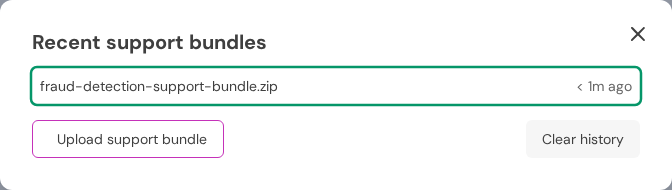 | Not available | Not available |
| Upload a bundle zip file | Click , then Upload support bundle.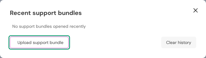 | Click the arrow next to View profile, then Open support bundle. | Click Load profile, then Open support bundle. |
After you select a zip file, click View profile to open it in a new tab.
| Support bundle | Profiles in it |
|---|---|
| Downloaded from a pipeline | The profiles that the pipeline collected at earlier points in time. If the pipeline is running and Collect new data is checked in the menu, the pipeline also collects a new profile now. |
| Uploaded | The profiles in the zip file, for example a bundle from the diagnostics guide. The Web Console adds the file to the list of bundles that you opened before. |
The parts of the viewer
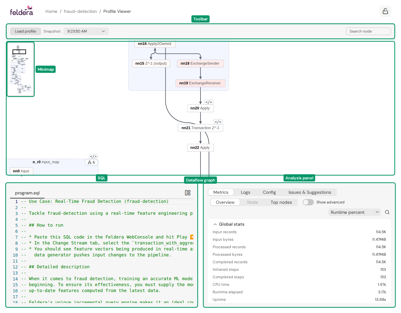
| Part | What it shows |
|---|---|
| Toolbar | Load profile gets a new bundle. Snapshot selects one of the profiles in the bundle. Search node finds a node. |
| Minimap | A map that shows which part of the dataflow graph is in the window |
| Dataflow graph | The nodes and edges of the pipeline |
| SQL | The SQL program of the pipeline. A click on a node selects its SQL here, if the node has a SQL source position. |
| Analysis panel | The tabs Metrics, Logs, Config and Issues & Suggestions |
The analysis panel has these tabs:
| Tab | Content |
|---|---|
| Metrics | The measurements of the pipeline, of the current node, or of the top nodes. See Displaying measurements. |
| Logs | The pipeline log from the bundle |
| Config | The pipeline configuration from the bundle |
| Issues & Suggestions | Problems that triage rules found in the bundle. See Issues & Suggestions. |
The button in the top right corner of the SQL panel stretches it to the full height of the window.
Moving around the dataflow graph
The dataflow graph can be much larger than the window.
| To | Do this |
|---|---|
| Zoom | Turn the mouse wheel |
| Pan | Click and drag the background of the dataflow graph |
| Go to another part of the dataflow graph | Click or drag on the minimap |
| See the full dataflow graph | Double-click the minimap |
| Find a node | Type a node ID, a table or view name, or a persistent ID in Search node, then press Enter. See Searching for a node. |
The current node
Click a node to make it the current node. The other parts of the viewer show information about the current node:
| Action | Result |
|---|---|
| Move the pointer over a node | The node glows. The other parts of the viewer do not change. |
| Click a node | The node becomes the current node and glows. The Node view of the Metrics tab shows its measurements, the SQL panel selects the SQL of the node, if the node has a SQL source position, and the edges show its reachability. |
| Press Escape | There is no current node. |
Nodes and SQL
A node with a Code chip has an associated SQL source position:
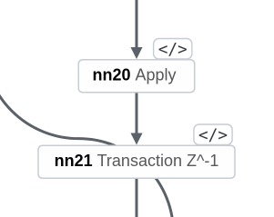
When you click such a node, the SQL panel selects the SQL statements of the node and scrolls to them:
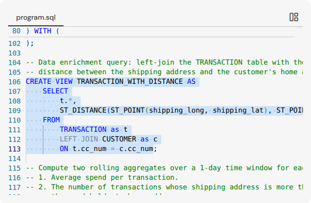
A click on a region selects the SQL of all the nodes in it. The relation between nodes and SQL statements is many-to-many. One statement can compile into many nodes, and one node can do the work of many statements. Some nodes have no SQL source position.
Reachability
The edges show the paths through the current node:
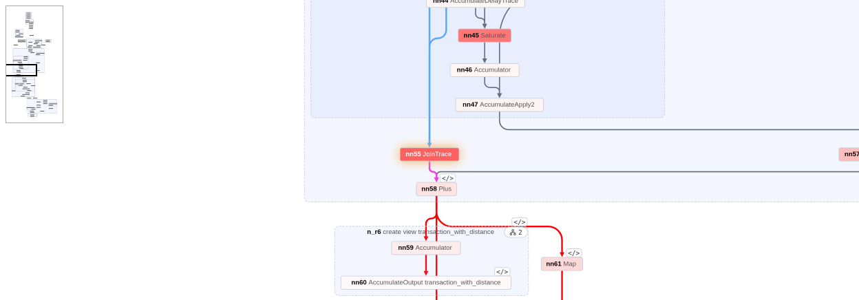
| Edge color | Meaning |
|---|---|
| Magenta | An edge out of the current node |
| Light blue | An edge into the current node |
| Red | An edge further downstream, on a path that starts at the current node |
| Blue | An edge further upstream, on a path that ends at the current node |
| Gray | An edge that is not on a path through the current node |
Most dataflow graphs have back edges: each integrator has one. The paths stop at a back edge.
Regions
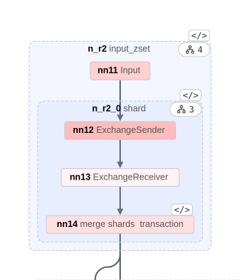
Some nodes contain another dataflow graph. These nodes are regions. You can expand a region to see the nodes in it. An expanded region has a dashed border, and its nodes are inside it:
A collapsed region is shown as a node:

| Decoration | Meaning |
|---|---|
| Name | The node ID of the region, and the names of the tables and views in it |
| Child count chip | The number of nodes in the region. The nodes in nested regions count, and the nested regions do not. |
| Code chip | The region has a SQL source position. See Nodes and SQL. |
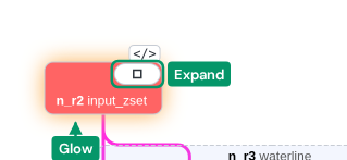
When you move the pointer over a top-level region, the region glows, and the child count chip changes to a square (expand) or a dash (collapse):
| To | Do this |
|---|---|
| Collapse or expand a region | Double-click it, or click its child count chip |
| Make a region the current node | Click it |
A small pipeline opens with all its regions expanded.
Displaying measurements
The measurements are values that the running pipeline collects for each node. You can display them, and use them to troubleshoot performance problems.
Each measurement is a value of a metric, for example Runtime percent. There are many metrics, and one of them is always the current metric. See The current metric.
The Metrics tab has three views:
| View | Content |
|---|---|
| Overview | The global statistics of the pipeline, and the aggregated measurements of all nodes |
| Node | The measurements of the current node |
| Top nodes | The top nodes according to the current metric |
Per-pipeline measurements
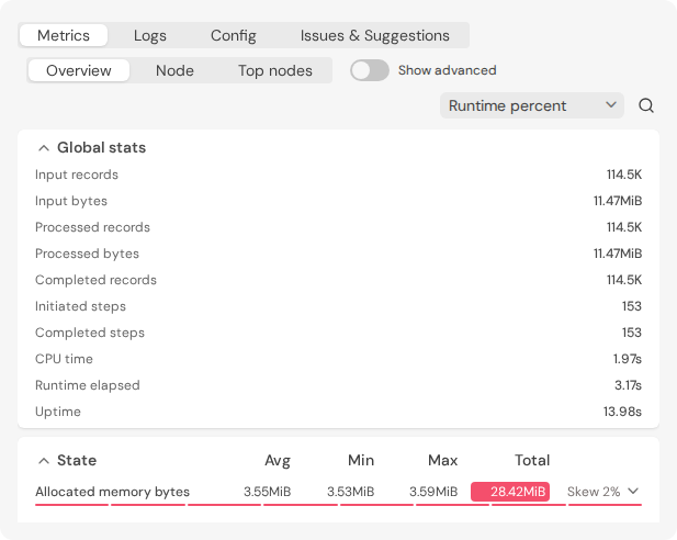
The Overview view shows the global statistics of the pipeline, for example the number of records that the pipeline received and processed, and its CPU time. Then it shows the measurements for the full dataflow graph.
Per-node measurements
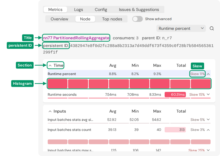
The Node view shows the measurements of the current node, in tables that group related measurements. The measurements of a region are aggregated measurements of the nodes in it.
Each node runs on multiple worker threads on each host of the pipeline. The profile has a value of each measurement for each worker. The Node view shows these values, and how much they differ between the workers.
| Part | What it shows |
|---|---|
| Title | The node ID and the name of its operator. Click it to center the dataflow graph on this node. |
| consumers | The number of nodes that read the output of this node |
| persistent ID | Two nodes with the same persistent ID compute the same result from the same table inputs. So the two nodes, and all the nodes before them, are semantically equivalent. |
| Section | A table of related measurements, for example Time or State. Click the title of a section to collapse or expand it. |
| Avg, Min, Max, Total | The average, minimum, maximum and sum of the measurement across the workers |
| Histogram | One bar for each worker. Move the pointer over a bar to see its value. |
| Skew | A measure of the resource imbalance between the workers. Higher skew is generally bad. Click it to make the histogram taller. |
The section that holds the current metric is shown first, and it does not collapse. In it, the current metric is the first row.
Some measurements have a red background. The intensity of the red shows how important the measurement is, relative to the highest values of that measurement in the whole dataflow graph.
Each node has only some of the measurements. For example, a node that keeps no state has no State section. Turn on Show advanced to show more measurements.
The current metric
To change the current metric, use the Select metric box at the top right of the Metrics tab:
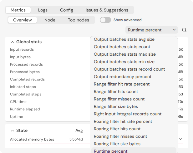
The current metric colors each node of the dataflow graph. The color shows how important the node is for this metric, when compared with the other nodes.
Top nodes
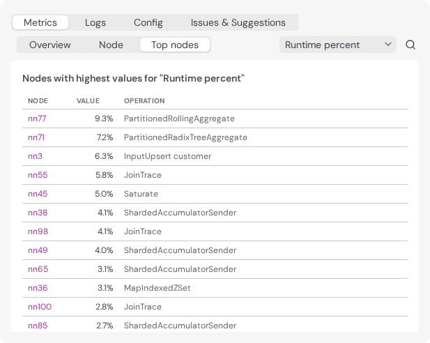
Top nodes lists the nodes that have a value for the current metric. The node most worthy of attention is first. Click a node ID to center the dataflow graph on that node.
Issues & Suggestions
The Issues & Suggestions tab shows the results of triage rules that the viewer runs on the bundle. The number on the tab is the number of results. Each result has:
| Part | What it shows |
|---|---|
| Severity | Critical, Medium or Low |
| Category | The area of the problem, for example Storage or Connector |
| Rule and message | The rule that found the problem, and what it found |
| Show details | The data that the rule found |
Use Filter by severity and Filter by category to show only some of the results. If the Feldera instance has no triage rules, the tab shows "No issues found".
Searching
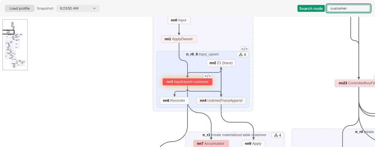
Searching for a node
Search node allows you to search for a node by one of these, in this order:
- The node ID, for example
nn21. - The name of a table or a view. An exact match is prioritized over a part of a name.
- A part of the persistent ID of the node.
When you press Enter, the viewer expands the regions that hold the node, centers the node in the window, and makes it glow. The node does not become the current node. Click it to make it the current node.
Searching in a tab
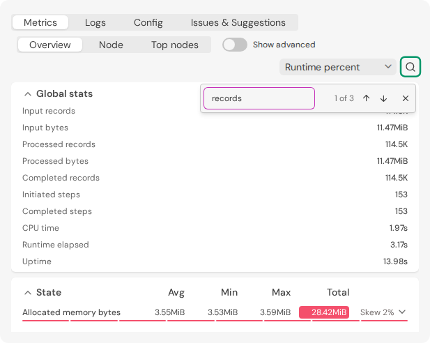
The button at the top right of the analysis panel searches the open tab below it:
| Tab | What the search finds |
|---|---|
| Metrics | The title of a section, the name or ID of a metric, or a row of Top nodes |
| Logs | A log line that contains the text |
| Issues & Suggestions | A result that contains the text |
Press Enter for the next match, and Shift+Enter for the previous match.
Keyboard search
| Keys | Where you clicked last | Result |
|---|---|---|
Ctrl-F (Cmd-F on macOS) | In the dataflow graph | Moves the focus to Search node |
Ctrl-F (Cmd-F on macOS) | Anywhere else | Opens the search of the open tab. It selects the old text, so you can type a new search immediately. |
| Escape | Removes the current node, or closes the search |
The Config tab does not have its own search. On this tab, Ctrl-F
opens the search of the browser.
Profiling pipelines using samply
Currently, Feldera uses a fork at feldera/samply as the upstream version doesn't work in EKS environments. To inspect the profiles generated by pipelines, you must install v0.13.2 or later of the fork, as some previously unstable features have changed between upstream release v0.13.1 and our fork.
Local environments
Before profiling in local environments, ensure the following requirements are met:
-
Install samply: Download and install samply version
0.13.2or later from the latest release. -
Configure kernel settings: Verify that
/proc/sys/kernel/perf_event_paranoidis set to 1 or lower. If the value is higher than 1, you can temporarily allow profiling with:echo -1 | sudo tee /proc/sys/kernel/perf_event_paranoid
Enterprise environments
Profiling a pipeline in Kubernetes needs two capabilities on the pipeline container:
| Capability | What samply needs it for |
|---|---|
PERFMON | Opening perf events under the node's kernel.perf_event_paranoid setting. |
IPC_LOCK | Mapping the perf ring buffer beyond the container's RLIMIT_MEMLOCK. |
Install or upgrade Feldera with the Helm value pipeline.allowProfiling
set to true, and the chart grants both. On a cluster that accepts
them, nothing else is needed.
When profiling still fails
The pipeline log carries the same perf_event_paranoid advice for
either failure. The first line tells them apart:
| samply error | Cause |
|---|---|
Failed to start profiling: Operation not permitted | The container lacks PERFMON. |
Failed to start profiling: mmap failed: Operation not permitted | The container lacks IPC_LOCK. |
In both cases, check what the pod actually got. Capabilities appear on the pod, not on the pipeline's service:
kubectl get pod -n <pipeline-namespace> <pipeline-pod> \
  -o jsonpath='{.spec.containers[0].securityContext.capabilities.add}'
The command prints ["PERFMON","IPC_LOCK"] when both are in place.
If a capability is missing, pipeline.allowProfiling is not reaching
this pipeline. Check that the value is set, and stop and start the
pipeline so that it picks up the change. A pipeline that uses a custom
template through pipeline_template_configmap needs both capabilities
added to that template by hand.
The chart started granting IPC_LOCK in Feldera 0.328.0. Earlier
versions grant PERFMON alone, and no Helm value adds IPC_LOCK to
them. A pipeline running there needs either an upgrade of the Feldera
release to 0.328.0 or later, or the node kernel setting below.
If a capability is still missing after all of that, cluster policy is removing it. If both are listed and profiling still fails, the node or the platform underneath it denies the operation. Either way, relax the node kernel setting, and contact Feldera support if that does not help.
Relaxing the node kernel setting
kernel.perf_event_paranoid defaults to 2. Setting it to -1
replaces both capabilities: it permits all perf events and skips the
memlock check. The value 1 that the log suggests replaces PERFMON
alone, and the ring buffer mmap still fails.
The setting is not namespaced, so no pod can set it for itself. It has to be applied to the node.
The setting applies to the whole node, so it relaxes the restriction for every pod scheduled there. Confine it to a node pool dedicated to pipelines.
How to apply it depends on the node operating system. On EKS,
Karpenter often provisions Bottlerocket nodes,
which have no shell and accept configuration only as TOML in userData:
apiVersion: karpenter.k8s.aws/v1
kind: EC2NodeClass
metadata:
  name: feldera-pipelines
spec:
  amiSelectorTerms:
    - alias: bottlerocket@latest
  # role, subnetSelectorTerms and securityGroupSelectorTerms unchanged
  userData: |
    [settings.kernel.sysctl]
    "kernel.perf_event_paranoid" = "-1"
Quote both the key and the value. Karpenter merges the block with the settings it generates itself. Existing nodes keep their old value, so replace them before profiling. On other node operating systems, apply the same sysctl through cloud-init user data or a node bootstrap script.
Example usage
Trigger profiling
# Start a 60 second profiling session
curl -X POST 'http://localhost:8080/v0/pipelines/my-pipeline/samply_profile?duration_secs=60'
Retrieve the profile
Wait for duration_secs for the profiling to complete. Then make a GET request to fetch the latest profile.
# Retrieve the profile (after the session completes)
curl 'http://localhost:8080/v0/pipelines/my-pipeline/samply_profile' -o prof.json.gz
Failures
400 Bad Request: If no profiles have been triggered or completed yet500 Internal Server Error: If there was an error during profiling
Inspect the profile
Use the Feldera fork of samply as described above to load the profile:
samply load prof.json.gz